Graphic

Graphic

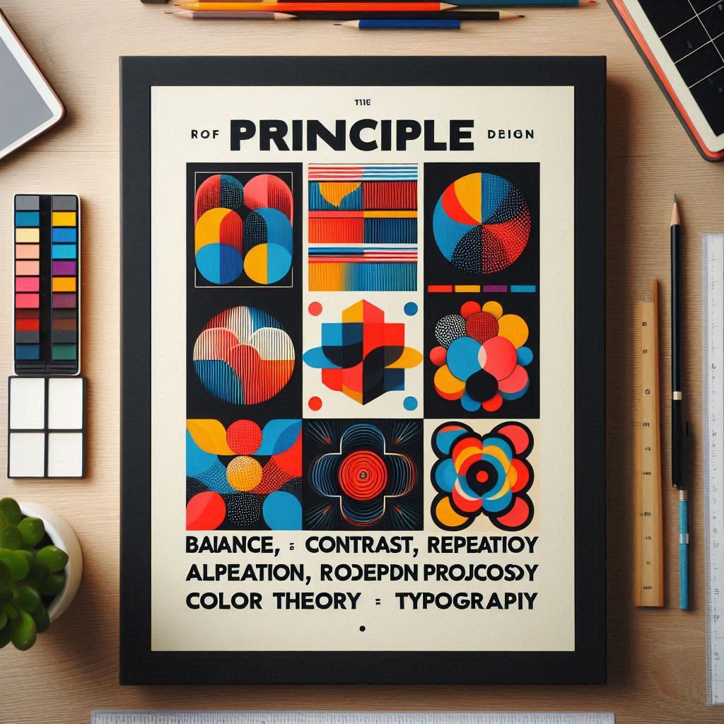
Understanding the Difference Between Vector and Raster Graphics

When working with images in design, art, or even data analysis, you’ll often encounter two primary types of graphics: vector and raster. Both are widely used, but they are fundamentally different in how they are created, manipulated, and displayed. Understanding these differences is essential, especially for graphic designers, photographers, and digital artists who need to choose the right format for their projects. What is Raster Graphics? Raster graphics, also known as bitmap graphics, are made up of a grid of individual pixels, each containing a color value. These pixels form a complete image when combined, much like the way a mosaic is made up of tiny colored tiles. Characteristics of Raster Graphics: Advantages of Raster Graphics: Disadvantages of Raster Graphics: Ideal Use Cases: What is Vector Graphics? Vector graphics differ fundamentally from raster images. They are created using mathematical equations that define shapes, lines, colors, and gradients, rather than pixels. Think of vector images as a set of instructions that tell the software how to create the image based on points and curves. Characteristics of Vector Graphics: Advantages of Vector Graphics: Disadvantages of Vector Graphics: Ideal Use Cases: Key Differences Between Raster and Vector Graphics Feature Raster Graphics Vector Graphics Composition Made of pixels Made of paths, points, and curves Resolution Fixed resolution (quality decreases when resized) Resolution-independent (scales without quality loss) Editing Limited editing (difficult to change parts) Easy to edit individual elements File Size Larger file size (especially at high resolution) Generally smaller file size Image Detail Excellent for complex images (e.g., photos) Best for simple designs and illustrations Ideal Use Photographs, textures, digital art Logos, icons, illustrations, technical drawings Software Adobe Photoshop, GIMP, Paint.NET Adobe Illustrator, CorelDRAW, Inkscape Choosing Between Raster and Vector: Which One Should You Use? The decision between raster and vector graphics depends entirely on your project needs: Conclusion Both vector and raster graphics have unique strengths and weaknesses, making them suited for different types of projects. Understanding these differences can help you choose the right format for your needs, whether you’re designing a logo, editing a photo, or creating a digital painting. By knowing when to use vector and when to use raster, you can ensure your designs look their best in any medium, whether on-screen or in print.

Digital Marketing, Graphic

How to Build a Strong Brand with Digital Marketing

In today’s competitive market, building a strong brand is essential for business success. Digital marketing offers powerful tools and strategies to enhance your brand’s visibility, credibility, and connection with your audience. Let’s explore how to leverage digital marketing to build a robust brand. 1. Define Your Brand Identity Before diving into marketing strategies, understand your brand identity. 2. Create Consistent Branding Consistency is key to brand recognition. Ensure your logo, color palette, typography, and messaging are consistent across all platforms. 3. Leverage Social Media Social media platforms like Facebook, Instagram, and LinkedIn are essential for brand building. 4. Content Marketing Content marketing helps establish authority and trust. 5. Email Marketing Email marketing is a direct line to your audience. 6. SEO Optimization SEO improves your website’s visibility in search engines. 7. Paid Advertising Invest in paid ads for faster results. Conclusion Building a strong brand with digital marketing requires time, consistency, and creativity. By defining your brand, leveraging social media, and utilizing effective content marketing, you can create a brand that resonates with your audience and stands out in the market.

Graphic

The Basics of Graphic Design : Principles Every Designer Should Know

Graphic design is more than just making things look good—it’s about communication, visual storytelling, and creating an impact. Whether you’re a beginner or an experienced designer, understanding the core principles of graphic design is essential. 1. Balance Balance ensures that design elements are evenly distributed to create a visually appealing composition. There are two main types of balance: 2. Contrast Contrast helps important elements stand out. It can be achieved through: 3. Alignment Proper alignment creates a clean, structured design. Everything should be visually connected to improve readability and aesthetics. Common types include: 4. Repetition Repetition reinforces a visual theme and improves brand recognition. It helps maintain consistency across different design elements like colors, fonts, and shapes. 5. Proximity Grouping related elements together makes a design look more organized. White space plays an important role in proximity, making content easy to scan. 6. Color Theory Colors evoke emotions and set the mood of a design. The color wheel helps designers choose the right color schemes: 7. Typography Typography is the art of arranging text. Choosing the right font is crucial for readability and branding. Key typography rules: Conclusion Mastering these design principles will help you create stunning, effective designs. Whether you’re working on a website, a logo, or a marketing campaign, these fundamentals will guide you in making professional and visually appealing graphics. Ready to start designing? Let us know your favorite principle in the comments below! 🎨🚀

Scroll to Top